Introduction: Why Your ServiceNow Data Is Useless Without Analytics
Let’s be brutally honest for a moment.
You’ve invested tens of thousands—maybe hundreds of thousands—of dollars into your ServiceNow platform. Incidents are being logged. Changes are being tracked. Service requests are flowing through beautifully designed workflows. Your data is growing by the minute.
But here’s the uncomfortable truth: if you’re not measuring it, you’re not managing it.
You might have a gut feeling that your incident resolution times have improved. You might think your team is hitting SLA targets. But can you prove it? Can you show your leadership a clear trendline? Can you identify exactly where bottlenecks are forming before they become full-blown crises?
That’s where ServiceNow Performance Analytics enters the picture—and changes everything.
If you’ve been staring at the Performance Analytics module wondering where to start, or if you’ve heard buzzwords like “KPIs,” “indicators,” and “breakdowns” thrown around in meetings without fully grasping what they mean, you’re in exactly the right place. This ServiceNow metrics guide is designed to take you from confusion to confidence, from data overload to data mastery.
Whether you’re a ServiceNow administrator setting up your first dashboard, an IT manager hungry for actionable insights, or a consultant looking to deliver more value to your clients, this guide will equip you with everything you need.
Let’s dive in.
What Is ServiceNow Performance Analytics?
ServiceNow Performance Analytics (PA) is a powerful, built-in module within the ServiceNow platform that allows organizations to create, track, and visualize Key Performance Indicators (KPIs) and metrics across virtually any process or workflow.
Think of it as the intelligence layer sitting on top of your operational data. While the rest of ServiceNow handles the doing—incident management, change management, HR service delivery—Performance Analytics handles the understanding.
What Makes It Different from Standard Reporting?
You might be wondering: “I already have reports and lists in ServiceNow. Why do I need Performance Analytics?”
Great question. Here’s the key difference:
| Feature | Standard Reporting | Performance Analytics |
|---|---|---|
| Data Snapshot | Current state only | Historical trends over time |
| Visualization | Basic charts and lists | Interactive dashboards with drill-down |
| Benchmarking | Manual comparison | Automated scoring and targets |
| Forecasting | Not available | Trend-based projections |
| Actionability | Passive | Proactive alerts and thresholds |
Standard reports tell you what happened. Performance Analytics tells you what’s happening, why it’s happening, and what’s likely to happen next.
That shift—from reactive to predictive—is what makes ServiceNow performance analytics a game-changer for organizations at every maturity level.
The Building Blocks: Understanding PA’s Core Components
Before you can build a stunning dashboard or set up ServiceNow KPI tracking, you need to understand the fundamental components that make Performance Analytics tick. Think of these as the Lego bricks from which everything is constructed.
1. Indicators (The Heart of Everything)
An indicator is the foundational element in Performance Analytics. It defines what you want to measure.
There are two primary types:
- Automated Indicators: These are generated automatically based on data collection jobs that run on a schedule. They pull data from your ServiceNow tables at regular intervals and store historical snapshots.
- Manual Indicators: These allow you to input data manually—useful when you’re tracking metrics from external systems or processes that don’t live in ServiceNow.
Example: An automated indicator might track “Number of Open P1 Incidents” by querying the Incident table every day at midnight. Over time, this builds a trendline showing whether your critical incident volume is increasing or decreasing.
Indicators can further be classified as:
- Count-based: How many records match a condition? (e.g., total incidents opened this month)
- Sum-based: What’s the total value of a numeric field? (e.g., total labor hours logged)
- Average-based: What’s the average of a numeric field? (e.g., average resolution time)
- Percentage-based: What fraction of records meet a condition? (e.g., percentage of incidents resolved within SLA)
2. Breakdowns (The Lens Through Which You Slice Data)
A breakdown lets you segment your indicator data by a specific dimension. It answers the question: “Show me this metric, but broken down by ___.”
Common breakdowns include:
- Assignment Group – Which team is handling the most incidents?
- Priority – How does volume differ across P1, P2, P3, P4?
- Category – Are network issues dominating, or is it software?
- Location – Is one office generating more tickets than others?
Breakdowns are incredibly powerful because they transform a single number into a multi-dimensional story. Without breakdowns, you’re looking at a flat total. With them, you’re uncovering patterns, outliers, and opportunities.
3. Data Sources
A data source defines the table and conditions from which your indicator pulls its data. When you create an indicator for incident management, your data source might point to the incident table with specific filters applied (e.g., only active incidents, only a particular assignment group).
Think of the data source as the pipeline that feeds your indicators with fresh data.
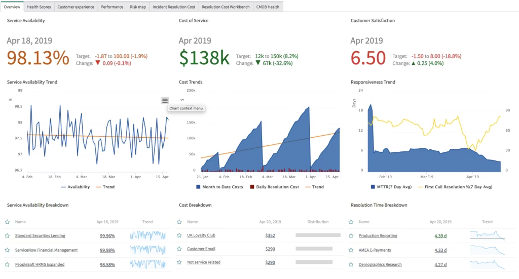
4. Widgets and Dashboards
Widgets are the visual representations of your data—bar charts, donut charts, speedometers, trendlines, scorecards, and more. These widgets are then arranged on dashboards to create a cohesive, at-a-glance view of your performance landscape.
A well-designed dashboard tells a story. It doesn’t just dump data on a screen; it guides the viewer’s eye through the narrative of their organization’s performance.
5. Targets and Thresholds
What’s a metric without a goal? Targets allow you to define what “good” looks like for each indicator. Thresholds add color-coded visual cues—green for on-track, yellow for at-risk, red for critical—that make it instantly clear whether performance is meeting expectations.
Example: You might set a target of 95% for SLA compliance. If the current score drops below 90%, the threshold turns red, immediately flagging the issue.
6. Scores and Snapshots
Every time a data collection job runs, it captures a score—a numerical snapshot of your indicator at that specific point in time. These scores accumulate over days, weeks, and months to build the historical trend data that makes Performance Analytics so valuable.
Setting Up Your First KPI: A Step-by-Step Walkthrough
Now that you understand the building blocks, let’s roll up our sleeves and create your first KPI. This practical walkthrough will show you exactly how ServiceNow KPI tracking works from start to finish.
Step 1: Define What You Want to Measure
Before touching the platform, grab a whiteboard (or a notebook, or your favorite notes app) and answer these questions:
- What process am I trying to improve?
- What does “success” look like for this process?
- Who is the audience for this metric?
- How frequently does the data need to be refreshed?
Practical Example: Let’s say you’re an ITSM manager and you want to track Mean Time to Resolution (MTTR) for incidents.
- Process: Incident Management
- Success: Average resolution time under 4 hours for P2 incidents
- Audience: IT leadership and assignment group managers
- Frequency: Daily snapshots
Step 2: Create the Indicator
- Navigate to Performance Analytics > Indicators > Create New
- Fill in the following fields:
- Name: Mean Time to Resolution – P2 Incidents
- Type: Automated
- Aggregate: Average
- Table: Incident [incident]
- Field: Business Duration (or your custom resolution time field)
- Conditions: Priority = 2 – High; State = Closed/Resolved
- Set the Direction to “Minimize” (because lower resolution times are better)
- Save your indicator
Step 3: Assign Breakdowns
After saving your indicator, navigate to the Breakdowns related list and add relevant breakdowns:
- Assignment Group
- Category
- Location
This will allow you to slice your MTTR data by team, incident type, and geography.
Step 4: Set Targets and Thresholds
- Go to Performance Analytics > Targets > Create New
- Associate the target with your MTTR indicator
- Set the Target Value to 4 hours (or 240 minutes, depending on your field format)
- Configure thresholds:
- Green: 0–4 hours
- Yellow: 4–6 hours
- Red: 6+ hours
Step 5: Run Data Collection
Navigate to Performance Analytics > Data Collection > Jobs and ensure that the data collector for the Incident table is active and scheduled. You can also manually trigger a collection to see immediate results.
Step 6: Build Your Dashboard
- Go to Performance Analytics > Dashboards > Create New
- Add widgets:
- A trendline widget showing MTTR over the last 90 days
- A bar chart widget showing MTTR by assignment group
- A scorecard widget showing current MTTR vs. target
- A donut chart showing breakdown by category
- Arrange your widgets logically—put the high-level scorecard at the top, detailed breakdowns below
- Share the dashboard with relevant users and groups
Congratulations! You’ve just set up your first end-to-end ServiceNow KPI tracking workflow. 🎉
Essential KPIs Every ServiceNow Team Should Track
Not sure which KPIs to start with? Here’s a curated list of high-impact metrics organized by ITSM process. Use this as your ServiceNow metrics guide starter kit.
Incident Management KPIs
- Mean Time to Resolution (MTTR) – How quickly are incidents resolved?
- First Contact Resolution Rate – What percentage of incidents are resolved on first contact?
- Incident Volume Trend – Is your ticket volume increasing, decreasing, or stable?
- Reopen Rate – How often are “resolved” incidents reopened?
- SLA Compliance Rate – What percentage of incidents meet their SLA targets?
Change Management KPIs
- Change Success Rate – What percentage of changes are implemented without causing incidents?
- Emergency Change Ratio – What proportion of changes are emergency vs. planned?
- Change Lead Time – How long does it take from change request to implementation?
- Failed Change Rate – How many changes result in rollbacks or failures?
Service Request KPIs
- Request Fulfillment Time – How quickly are service requests completed?
- Request Volume by Category – Which types of requests are most common?
- Customer Satisfaction (CSAT) Score – How satisfied are users with the service they received?
Problem Management KPIs
- Known Error Backlog – How many known errors are waiting for resolution?
- Problem Resolution Time – How long does root cause analysis take?
- Incidents Linked to Problems – How many incidents are tied to identified problems?
HR Service Delivery KPIs (If applicable)
- Case Resolution Time – How quickly are HR cases resolved?
- Employee Satisfaction Score – How do employees rate their HR service experience?
- Case Volume by Category – Which HR topics generate the most inquiries?
Advanced Tips: Taking Your Analytics to the Next Level
Once you’ve mastered the basics, it’s time to unlock the advanced capabilities that separate good analytics from great analytics.
1. Interactive Filters for Self-Service Exploration
Add interactive filters to your dashboards so that stakeholders can explore the data on their own. Instead of building 15 separate dashboards for 15 assignment groups, build one dashboard with a group filter. Empower your users to find their own answers.
2. Analytics Hubs for Contextualized Insights
ServiceNow’s Analytics Hub (available in newer releases) provides a more modern, interactive analytics experience with natural language querying. If you’re on the Washington DC release or later, explore this feature—it’s a game-changer for non-technical users who want to ask questions of their data in plain English.
3. Automated Score Notifications
Set up notifications that automatically alert stakeholders when a KPI crosses a threshold. For example, if SLA compliance drops below 85%, automatically send an email to the service desk manager. This turns your analytics from a passive reporting tool into an active early-warning system.
4. Benchmarking with Indicator Groups
Use indicator groups to benchmark performance across different teams, regions, or time periods. This is especially powerful for large enterprises with multiple service desks or shared service centers.
5. PA Widgets in Agent Workspace
Embed Performance Analytics widgets directly into the Agent Workspace so that frontline agents can see real-time performance data without navigating to a separate dashboard. This creates a culture of continuous awareness and accountability.
6. Time Series Analysis and Forecasting
Leverage PA’s built-in time series capabilities to identify seasonal patterns and forecast future performance. If you know that incident volume spikes every January (hello, post-holiday IT issues), you can proactively staff up your service desk.
7. Leveraging the PA API
For organizations with custom portals or external BI tools, the Performance Analytics API allows you to extract PA data programmatically. This is invaluable for feeding ServiceNow metrics into enterprise-wide reporting platforms like Power BI or Tableau.
Common Mistakes to Avoid
Even experienced ServiceNow administrators fall into these traps. Learn from others’ mistakes so you don’t repeat them.
❌ Measuring Everything
Just because you can create an indicator for every field on every table doesn’t mean you should. More metrics don’t equal better insights. They equal more noise. Focus on the 10-15 KPIs that truly drive business outcomes.
❌ Ignoring Data Quality
Performance Analytics is only as good as the data feeding it. If your incident categories are inconsistent, your breakdowns will be meaningless. If agents aren’t closing tickets properly, your resolution time metrics will be skewed. Invest in data hygiene before investing in analytics.
❌ Building Dashboards Without an Audience in Mind
A dashboard designed for a CIO should look dramatically different from one designed for a service desk manager. Always start with the question: “Who is this dashboard for, and what decisions will they make based on it?”
❌ Setting Unrealistic Targets
If your current MTTR is 12 hours, setting a target of 1 hour will just create a permanently red dashboard that everyone ignores. Set ambitious but achievable targets, and adjust them as performance improves.
❌ Neglecting Historical Data
One of PA’s greatest strengths is its ability to store and visualize historical trends. Don’t just look at today’s score—look at the 90-day, 180-day, and 365-day trendlines. Context is everything.
❌ Forgetting About Governance
As your PA environment grows, you’ll end up with hundreds of indicators, breakdowns, and dashboards created by different people with different naming conventions. Establish a governance framework early: naming standards, ownership assignments, review schedules, and archival processes.
Real-World Use Case: How a Global Enterprise Transformed Their IT Operations
Let me paint a picture of what’s possible.
A global manufacturing company with 50,000 employees and 12 regional service desks was struggling with inconsistent service quality. Some regions had MTTR under 2 hours; others were north of 16 hours. Leadership had no visibility into why.
By implementing a comprehensive ServiceNow performance analytics strategy, they:
- Created standardized KPIs across all 12 service desks—MTTR, FTCR, SLA compliance, reopen rate, and CSAT
- Built a global executive dashboard with drill-down capabilities from global → regional → team → individual agent
- Set uniform targets and thresholds so that performance expectations were consistent worldwide
- Automated weekly performance reports sent to regional directors every Monday morning
- Identified root causes through breakdown analysis—two regions had high MTTR because of a lack of Tier 2 support during local nighttime hours
Within six months:
- Global MTTR dropped by 34%
- SLA compliance improved from 78% to 93%
- Employee satisfaction scores (measured through post-resolution surveys) increased by 22%
That’s the power of data-driven decision-making. That’s the power of Performance Analytics.
Performance Analytics Licensing: What You Need to Know
It’s worth noting that Performance Analytics capabilities vary based on your ServiceNow licensing tier:
- PA Standard (included with ITSM Pro/Enterprise): Provides access to predefined indicators, dashboards, and basic analytics for ITSM processes.
- PA Premium (add-on or included with higher tiers): Unlocks advanced features like custom indicators, forecasting, benchmarking, and the Analytics Hub.
Before embarking on an ambitious PA initiative, verify your licensing entitlements with your ServiceNow account representative. There’s nothing more frustrating than designing a solution you can’t deploy.
For the latest details on what’s included in each package, check out the official ServiceNow Performance Analytics documentation.
Integrating Performance Analytics with Other ServiceNow Modules
One of the beautiful things about PA is that it doesn’t exist in a vacuum. It integrates seamlessly with other ServiceNow modules to create a holistic analytics ecosystem.
Continual Improvement Management (CIM)
When PA reveals a performance gap, you can create a CIM initiative directly from the dashboard. This closes the loop between identifying a problem and taking action to fix it.
Virtual Agent and AI
Combine PA insights with ServiceNow’s Virtual Agent to create automated responses based on real-time performance data. If PA detects that a specific category of incidents is spiking, the Virtual Agent can proactively surface relevant knowledge articles to users.
CMDB and Service Mapping
Overlay your PA data with CMDB information to correlate performance metrics with specific configuration items. Is a particular server causing a disproportionate number of incidents? PA + CMDB will tell you.
HRSD, CSM, and Beyond
Performance Analytics isn’t limited to ITSM. You can create KPIs and dashboards for HR Service Delivery, Customer Service Management, Security Operations, and virtually any other ServiceNow application. The framework is the same; only the data sources change.
Your PA Implementation Roadmap
If you’re ready to get started, here’s a phased approach that we recommend at RizeX Labs:
Phase 1: Foundation (Weeks 1-4)
- Identify top 5-10 KPIs aligned with business objectives
- Configure indicators, breakdowns, and data sources
- Set up data collection schedules
- Build your first executive dashboard
Phase 2: Expansion (Weeks 5-8)
- Extend analytics to additional ITSM processes
- Add targets and thresholds
- Configure automated notifications
- Train stakeholders on dashboard usage
Phase 3: Optimization (Weeks 9-12)
- Implement advanced features (forecasting, benchmarking, indicator groups)
- Integrate with CIM for closed-loop improvement
- Establish governance framework
- Conduct first quarterly analytics review
Phase 4: Maturity (Ongoing)
- Expand PA to non-ITSM modules (HRSD, CSM, SecOps)
- Leverage Analytics Hub for self-service exploration
- Build custom PA solutions using the PA API
- Continuously refine KPIs based on evolving business needs
Ready to Unlock the Power of Your ServiceNow Data?
If this guide has shown you anything, it’s that ServiceNow performance analytics isn’t just a nice-to-have—it’s the engine that transforms raw operational data into strategic intelligence.
Whether you’re just getting started with your first indicator or you’re ready to build an enterprise-wide analytics program, the journey begins with a single step.
Here’s what we’d love you to do next:
🔹 Bookmark this guide and refer back to it as you build out your PA environment
🔹 Share it with your team—the more people who understand PA, the more value you’ll extract from it
🔹 Drop a comment below telling us which KPI you’re going to set up first—we’d love to hear from you!
🔹 Contact RizeX Labs if you need expert guidance on your ServiceNow Performance Analytics implementation
At RizeX Labs, we specialize in helping organizations harness the full power of the ServiceNow platform—from strategy and implementation to optimization and managed services. Our team of certified ServiceNow experts has helped dozens of organizations transform their analytics capabilities and drive measurable business outcomes.
Your data is telling a story. It’s time to start listening.
Have questions about ServiceNow Performance Analytics, KPI tracking, or anything else ServiceNow-related? Reach out to the RizeX Labs team—we’re always here to help.
Last updated: 2025. For the latest ServiceNow documentation and release notes, visit the ServiceNow Developer Portal and ServiceNow Community.
Quick Summary
ServiceNow Performance Analytics empowers organizations to move beyond reactive reporting and into proactive, data-driven decision-making. This comprehensive guide walks you through everything from understanding the foundational building blocks—indicators, breakdowns, data sources, and widgets—to setting up your first KPI dashboard and leveraging advanced features like automated scoring and trend analysis. Whether you're a beginner configuring your first metric or a seasoned admin looking to optimize your analytics strategy, this guide provides practical, step-by-step instructions, real-world examples, and expert tips to help you unlock the full potential of ServiceNow performance analytics.