Introduction: Why Salesforce Reporting Matters
If you’re just starting your Salesforce journey, you’ve probably heard phrases like “pull a report” or “check the dashboard” more than once. But what do these terms actually mean, and why should you care?
Welcome to this Salesforce reports and dashboards tutorial — your complete beginner guide to understanding, creating, and optimizing reports and dashboards in Salesforce CRM. Whether you’re a student preparing for a Salesforce certification, a job seeker looking to impress employers, or a new Salesforce user trying to find your footing, this guide is built specifically for you.
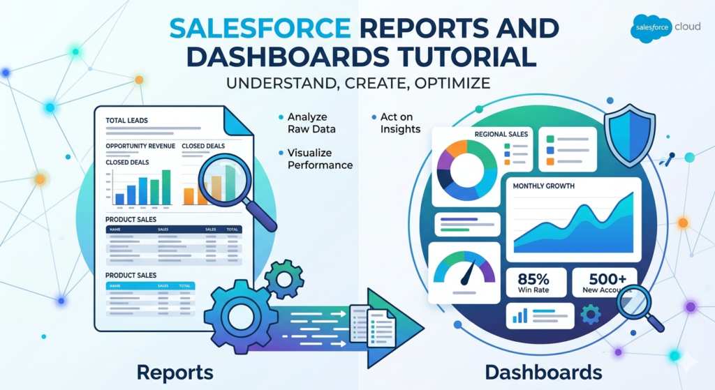
Salesforce is one of the world’s most powerful Customer Relationship Management (CRM) platforms. It stores enormous amounts of business data — leads, opportunities, accounts, cases, and much more. But raw data sitting in a system isn’t useful on its own. You need a way to analyze, visualize, and act on that data. That’s exactly where reports and dashboards come in.
Real-world example: Imagine a sales manager who wants to know which sales rep closed the most deals last month, which products are selling best, and which leads are going cold. Instead of manually sorting through thousands of records, they simply open their Salesforce dashboard and see all the answers in seconds.
That’s the power of Salesforce reporting — and by the end of this tutorial, you’ll know exactly how to harness it.
What Are Salesforce Reports?
Definition and Purpose
A Salesforce report is a list of records that meet specific criteria you define. Think of it like a smart, filtered view of your Salesforce data, presented in a structured format that makes it easy to read, analyze, and share.
Reports can answer questions like:
- How many leads did we generate this quarter?
- Which accounts haven’t been contacted in 30 days?
- What is the total value of open opportunities in the pipeline?
- How many support cases were resolved this week?
Reports pull data directly from Salesforce objects (like Accounts, Contacts, Leads, Opportunities) and present them in organized rows and columns.
Key Components of a Salesforce Report
Understanding these building blocks will make report creation much easier:
| Component | Description |
|---|---|
| Fields | The columns of data displayed (e.g., Name, Amount, Close Date) |
| Filters | Rules that limit which records appear (e.g., “Stage = Closed Won”) |
| Groupings | Ways to organize records into categories (e.g., group by Owner or Stage) |
| Summary Fields | Calculations like SUM, COUNT, AVG applied to grouped data |
| Report Format | The layout style — Tabular, Summary, Matrix, or Joined |
Benefits of Using Salesforce Reports
- ✅ Make data-driven decisions faster
- ✅ Track team performance and individual KPIs
- ✅ Identify trends and patterns over time
- ✅ Share insights across teams and departments
- ✅ Automate reporting instead of manual spreadsheet work
- ✅ Feed data into dashboards for visual storytelling
Salesforce Report Types
One of the most important concepts in this Salesforce reports and dashboards tutorial is understanding report types. A report type defines which objects and fields are available when you build a report.
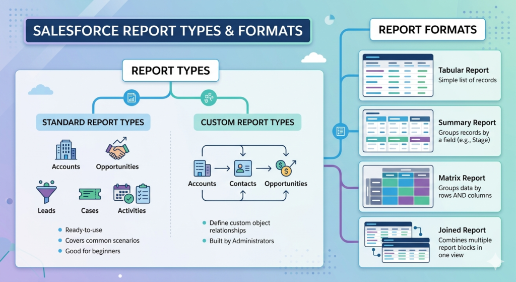
Standard Report Types
Salesforce comes with dozens of built-in (standard) report types that are ready to use immediately. These cover the most common business scenarios.
Examples of standard report types:
- Accounts — View all account records and related fields
- Opportunities — Track deals in your pipeline
- Leads — Monitor incoming lead activity
- Cases — Analyze customer support tickets
- Activities — Review calls, emails, and tasks
Standard report types are great for beginners because they require no setup. You just pick one and start building.
Custom Report Types
When standard report types don’t meet your needs — for example, when you need to combine data from multiple related objects — you create a custom report type.
Example: Suppose you want a report showing all Accounts that have at least one Contact AND at least one Opportunity. No standard report type does this out of the box, so you’d create a custom report type that links Accounts → Contacts → Opportunities.
Custom report types are built by Salesforce Administrators and require a deeper understanding of object relationships. As a beginner, focus on standard report types first.
The Four Report Formats
Beyond report types, Salesforce offers four report formats that control how your data is displayed:
- Tabular Report — The simplest format; a flat list of records with no groupings. Best for exporting data or simple lists.
- Summary Report — Groups records by a field (e.g., group opportunities by Stage). Great for totals and subtotals.
- Matrix Report — Groups data both by rows AND columns. Perfect for comparing data across two dimensions (e.g., sales by rep by month).
- Joined Report — Combines multiple report blocks in one view. Advanced format for complex comparisons.
Beginner Tip: Start with Summary Reports — they’re the most versatile and commonly used format in real Salesforce environments.
How to Create a Report in Salesforce — Step-by-Step Guide
Now let’s get hands-on. Here’s exactly how to create a report in Salesforce, step by step.
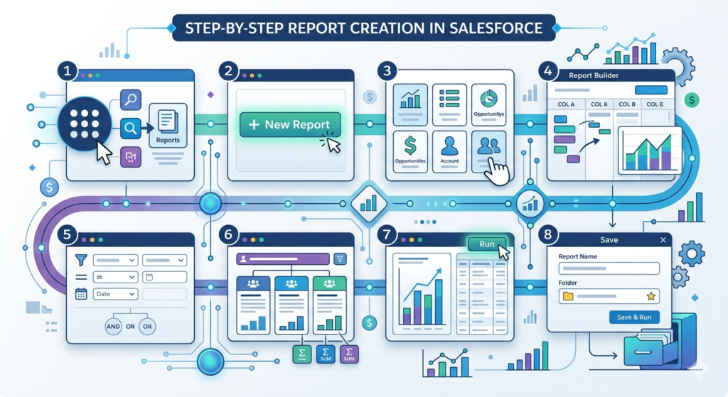
Step 1: Navigate to the Reports Tab
- Log into your Salesforce org
- Click the App Launcher (the nine-dot grid icon in the top left)
- Search for “Reports” or find it in your navigation bar
- Click Reports to open the Reports Home page
Step 2: Click “New Report”
- On the Reports Home page, click the New Report button (usually in the top right corner)
Step 3: Choose a Report Type
- A dialog box will appear showing available report types
- Browse categories (Accounts & Contacts, Opportunities, Leads, etc.)
- Select the appropriate report type (e.g., “Opportunities”)
- Click Start Report
Step 4: Add and Arrange Columns (Fields)
- The Report Builder will open
- On the left panel, you’ll see available Fields
- Drag and drop fields into the report preview area, or double-click to add them
- Common fields to add: Name, Owner, Amount, Close Date, Stage
Step 5: Add Filters
- Click the Filters tab in the left panel
- Add filter criteria to limit your data
- Example filters:
- “Close Date = This Quarter”
- “Stage = Prospecting”
- “Owner = Current User”
- Combine multiple filters using AND/OR logic
Step 6: Group Your Data (for Summary/Matrix Reports)
- Drag a field into the Group Rows section
- Example: Group by “Stage” to see opportunity totals per stage
- Add summary fields (SUM of Amount, COUNT of records)
Step 7: Preview and Run the Report
- Click Run (top right) to see live results
- Review the data to make sure it looks correct
- Go back to the builder to adjust filters or fields if needed
Step 8: Save the Report
- Click Save & Run
- Enter a Report Name (be descriptive — e.g., “Q3 Opportunities by Stage”)
- Choose a Report Folder (organize by team or function)
- Click Save
💡 Pro Tips for Creating Reports
Pro Tip #1: Always preview your report with a small date range first to check if filters work correctly before running it on large datasets.
Pro Tip #2: Use relative date filters (like “This Month,” “Last 30 Days”) instead of fixed dates so your report stays relevant over time.
Pro Tip #3: Save frequently used reports in shared folders so your whole team can access them without recreating them.
Pro Tip #4: Add a description when saving your report — future you (and your colleagues) will thank you.
What Are Salesforce Dashboards?
Definition and Purpose
A Salesforce dashboard is a visual display of key metrics and data, powered by reports. Think of it as the “executive summary” of your data — instead of reading through rows and columns, you see charts, gauges, numbers, and tables at a glance.
Dashboards are made up of components, and each component is powered by an underlying report.
Difference Between Reports and Dashboards
| Feature | Reports | Dashboards |
|---|---|---|
| Format | Rows and columns | Visual charts and metrics |
| Purpose | Detailed data analysis | High-level performance snapshot |
| Based on | Salesforce objects | Salesforce reports |
| Interactivity | Filterable, exportable | Clickable, real-time |
| Audience | Analysts, managers | Executives, teams |
Key Dashboard Components
- Bar/Column Charts — Compare values across categories
- Line Charts — Show trends over time
- Pie/Donut Charts — Show proportions of a whole
- Metric — Display a single key number (e.g., Total Revenue This Month)
- Gauge — Show progress toward a goal
- Table — Display tabular data (like a mini-report)
- Funnel Chart — Show pipeline stages or conversion rates
Salesforce Dashboard Examples
This section explores three powerful Salesforce dashboard examples you’ll commonly encounter in real business environments.
1. Sales Performance Dashboard
What it shows:
- Total closed revenue vs. target
- Pipeline value by stage
- Top 10 sales reps by revenue
- Win rate percentage
- Average deal size
Why it matters: Sales managers use this dashboard daily to track team performance, identify who needs coaching, and forecast end-of-quarter numbers. A sales rep can also view a personal version to monitor their own progress against quota.
Common components: Gauge (quota attainment), Bar Chart (rep performance), Funnel (pipeline stages), Metric (total revenue)
2. Marketing Campaign Dashboard
What it shows:
- Leads generated per campaign
- Campaign ROI
- Conversion rates (Lead → Opportunity)
- Cost per lead by channel
- Email open and click rates
Why it matters: Marketing teams use this to understand which campaigns are generating quality leads and driving revenue. It helps reallocate budget to high-performing channels and pause underperforming ones.
Common components: Bar Chart (leads by campaign), Line Chart (lead trend over time), Table (campaign ROI breakdown), Metric (total leads this month)
3. Customer Support Dashboard
What it shows:
- Open cases by priority
- Average case resolution time
- Cases by support agent
- Customer satisfaction (CSAT) scores
- Cases opened vs. closed this week
Why it matters: Support managers rely on this dashboard to ensure SLAs (Service Level Agreements) are being met, identify bottlenecks, and recognize top-performing agents. Executives use it to monitor overall customer experience quality.
Common components: Gauge (SLA compliance), Donut Chart (cases by priority), Table (agent performance), Metric (open cases)
How to Create a Dashboard in Salesforce — Step-by-Step
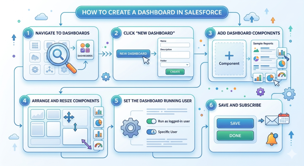
Step 1: Navigate to Dashboards
- Click the App Launcher and search “Dashboards”
- Click on Dashboards in the navigation
Step 2: Click “New Dashboard”
- Click the New Dashboard button
- Enter a name and optional description
- Choose a folder to save it in
- Click Create
Step 3: Add Dashboard Components
- Click + Component in the dashboard editor
- Select a source report (the report powering this component)
- Choose a visualization type (bar chart, donut, metric, etc.)
- Configure the display settings (header, labels, sort order)
- Click Add
Step 4: Arrange and Resize Components
- Drag components to rearrange them on the grid
- Resize by dragging the edges of each component
- Group related metrics together for logical flow
Step 5: Set the Dashboard Running User
- Click the gear icon or Settings
- Choose Running User — this determines whose data the dashboard shows
- Options: “Run as logged-in user” (everyone sees their own data) or a specific user
Step 6: Save and Subscribe
- Click Save
- Click Done to exit edit mode
- Use the Subscribe button to receive email snapshots of the dashboard on a schedule
Best Practices for Reports and Dashboards
Following best practices ensures your reporting is clean, accurate, and actually useful.
Naming Conventions
- Use clear, descriptive names: “Sales — Open Opportunities by Stage — Q4 2024”
- Include team name, topic, and time frame
- Avoid vague names like “Report 1” or “My Dashboard”
Data Accuracy Tips
- Regularly audit your filters — outdated filters lead to misleading results
- Use standardized picklist values across your org to avoid fragmented groupings
- Validate data at the entry point (good reports require good data input)
Performance Optimization
- Avoid building reports with no filters on large datasets — this slows Salesforce down
- Use relative date filters (This Month, Last Quarter) to avoid constant manual updates
- Limit dashboard components to 10–15 per dashboard for optimal load times
Organizing Your Report and Dashboard Library
- Use folders to organize by department (Sales, Marketing, Support)
- Set appropriate folder permissions so the right people see the right data
- Archive old reports rather than deleting them — someone might need them later
Common Beginner Mistakes to Avoid
Even with the best intentions, beginners often fall into these traps:
1. Overusing Filters
Adding too many filters can make a report so restrictive that it shows no data — or misleading data. Always check what your filters are excluding.
2. Choosing the Wrong Report Type
Using a Tabular report when you need groupings and totals is a classic mistake. Always think about what you need to analyze before choosing a format.
3. Poor Dashboard Design
Cramming 20 components onto one dashboard makes it impossible to read. Follow the rule of clarity over completeness — less is more.
4. Ignoring Report Folders
Leaving all reports in “My Personal Reports” means no one else can access or benefit from them. Use shared folders.
5. Not Scheduling Dashboard Refreshes
Dashboards don’t auto-refresh unless you set them to. Always configure refresh settings and subscriptions for time-sensitive dashboards.
Real-World Use Cases of Salesforce Reports and Dashboards
Understanding how companies actually use this functionality brings it to life:
🏢 Enterprise Sales Teams use pipeline dashboards every Monday morning during their “forecast calls” to discuss which deals are likely to close.
🏥 Healthcare Organizations use case reports to track patient intake and support ticket resolution across departments.
🛍️ E-commerce Companies use marketing dashboards to measure which ad campaigns are converting visitors into paying customers.
🏦 Financial Services Firms use activity reports to ensure compliance — tracking which clients were contacted and when.
📱 Tech Startups use custom dashboards to monitor product adoption metrics and customer health scores.
In each scenario, reports and dashboards are not just a “nice to have” — they’re central to daily decision-making. Teams that master Salesforce reporting gain a serious competitive advantage.
Conclusion: Start Building Today
Congratulations — you’ve just completed a full Salesforce reports and dashboards tutorial from start to finish. Let’s recap what you’ve learned:
- Salesforce Reports let you pull, filter, and analyze your CRM data
- Report Types and Formats determine what data is available and how it’s displayed
- Creating a report is a step-by-step process: choose type → add fields → set filters → group → save
- Dashboards turn reports into powerful visual snapshots for quick decision-making
- Real-world dashboard examples include Sales, Marketing, and Support use cases
- Best practices and common mistakes help you build better from day one
The best way to truly master this material is hands-on practice. If you have access to a Salesforce Trailhead playground (it’s free!), go build your first report right now. Try creating a Summary Report on Opportunities, then build a dashboard with at least three components.
About RizeX Labs
At RizeX Labs, we specialize in delivering cutting-edge Salesforce solutions, including advanced reporting and analytics capabilities within the Salesforce ecosystem. Our expertise combines deep technical knowledge, industry best practices, and real-world implementation experience to help businesses transform raw data into meaningful insights.
We empower organizations to move from basic data tracking to intelligent reporting systems—leveraging Salesforce reports and dashboards to improve decision-making, boost productivity, and drive business growth.
Internal Links:
- Link to your Salesforce course page
- How to Build a Salesforce Portfolio That Gets You Hired (With Project Ideas)
- Salesforce Admin vs Developer: Which Career Path is Right for You in 2026?
- Wealth Management App in Financial Services Cloud
- Salesforce Admin course page
External Links:
- Salesforce official website
- Salesforce Reports & Dashboards guide
- Salesforce Trailhead (Reports & Dashboards modules)
- Salesforce AppExchange (Analytics tools)
- Data visualization best practices (Tableau)
Quick Summary
The salesforce reports and dashboards tutorial is essential for anyone looking to understand how to analyze and visualize data effectively within Salesforce. Reports allow users to organize and filter data, while dashboards provide a visual representation through charts, tables, and metrics.
By learning salesforce report types and understanding how to create report salesforce, users can unlock powerful insights into sales performance, customer behavior, and operational efficiency. Additionally, exploring salesforce dashboard examples helps beginners understand how businesses track KPIs and make data-driven decisions.
With the right approach, Salesforce reporting tools enable organizations to reduce manual work, improve data accuracy, and gain real-time visibility into their business processes—making them a critical component of any successful CRM strategy.
Quick Summary
Salesforce reports and dashboards are two of the most powerful and practically essential features within the Salesforce CRM platform, designed to help businesses transform raw, unorganized data into meaningful, actionable insights that drive smarter decision-making across every department. A Salesforce report is a structured, filterable, and groupable view of your CRM data — pulling records from objects like Opportunities, Leads, Accounts, Cases, and Activities — and presenting them in one of four formats: Tabular for simple flat lists, Summary for grouped totals and subtotals, Matrix for two-dimensional comparisons, and Joined for complex multi-block analysis. Reports are built using a combination of fields (the data columns you want to see), filters (the rules that determine which records appear), and groupings (the categories that organize your data into digestible sections), making them incredibly flexible for everything from tracking sales pipeline health to monitoring customer support performance. Dashboards, on the other hand, take those reports one step further by converting the data into stunning visual representations — bar charts, line graphs, pie charts, gauges, metrics, and tables — all displayed together on a single, at-a-glance screen that gives managers, executives, and team leads an instant snapshot of business performance without having to dig through rows of data. Common real-world Salesforce dashboard examples include the Sales Performance Dashboard (which tracks quota attainment, pipeline stages, and top-performing reps), the Marketing Campaign Dashboard (which measures lead generation, campaign ROI, and channel conversion rates), and the Customer Support Dashboard (which monitors open cases, resolution times, SLA compliance, and agent performance). Creating both reports and dashboards in Salesforce follows a logical, beginner-friendly step-by-step process — from selecting the right report type, adding relevant fields and filters, grouping data meaningfully, and saving with a clear naming convention, to building dashboard components, choosing the right visualizations, arranging them strategically, and scheduling automated email subscriptions for regular updates. Best practices such as using relative date filters, saving reports in shared team folders, limiting dashboard components to avoid visual clutter, and regularly auditing data accuracy ensure that your reports and dashboards remain reliable, relevant, and genuinely useful over time. Whether you are a Salesforce beginner, an aspiring Salesforce Administrator preparing for certification, or a business professional looking to make smarter data-driven decisions, mastering Salesforce reports and dashboards is not just a valuable skill — it is an absolute game-changer that puts the full power of your CRM data right at your fingertips.