
Introduction: Why Salesforce Reports & Dashboards Matter
If you're learning Salesforce, mastering Salesforce Reports & Dashboards isn't optional—it's essential.
Here's the reality: Organizations don't adopt Salesforce just to store data. They need insights. They need to track sales performance, monitor customer service metrics, and make data-driven decisions. That's where reports and dashboards come in.
As a Salesforce beginner—whether you're an admin, a fresh graduate, or a job seeker—your ability to create meaningful reports and visual dashboards will set you apart. Employers expect this skill. Interviews test it. Day-to-day work requires it.
This Salesforce reports and dashboards tutorial will teach you exactly how to build reports from scratch, create interactive dashboards, avoid common pitfalls, and apply these skills in real-world scenarios. No fluff. Just practical, actionable steps.
Let's start with the foundation.
What Are Salesforce Reports?
A Salesforce report is a list of records that meet specific criteria you define. Think of it as a filtered, organized view of your data.
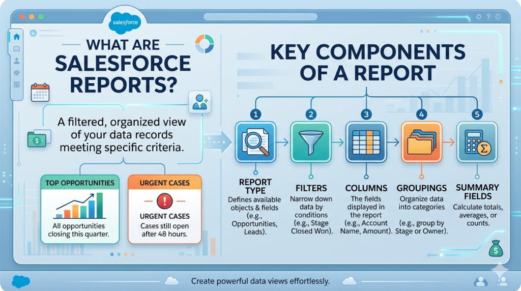
For example:
- All opportunities closing this quarter
- Leads created in the last 30 days
- Cases still open after 48 hours
- Accounts with annual revenue above $1 million
Reports answer questions like:
- How many deals did we close this month?
- Which sales rep has the most open opportunities?
- What's our average case resolution time?
Reports are stored in folders and can be shared across teams, scheduled to run automatically, and exported to Excel.
Key Components of a Salesforce Report
Before diving into creation, understand these core elements:
Report Type: Defines which objects and fields you can report on (e.g., Opportunities, Leads, Accounts).
Filters: Narrow down data based on conditions (e.g., "Opportunity Stage equals Closed Won").
Columns: The fields displayed in your report (e.g., Account Name, Amount, Close Date).
Groupings: Organize data into categories (e.g., group opportunities by Stage or Owner).
Summary Fields: Calculate totals, averages, or counts (e.g., total opportunity amount).
Now let's explore the four types of reports you'll work with.
Types of Salesforce Reports Explained
Choosing the right report format is critical. Each type serves a different purpose.
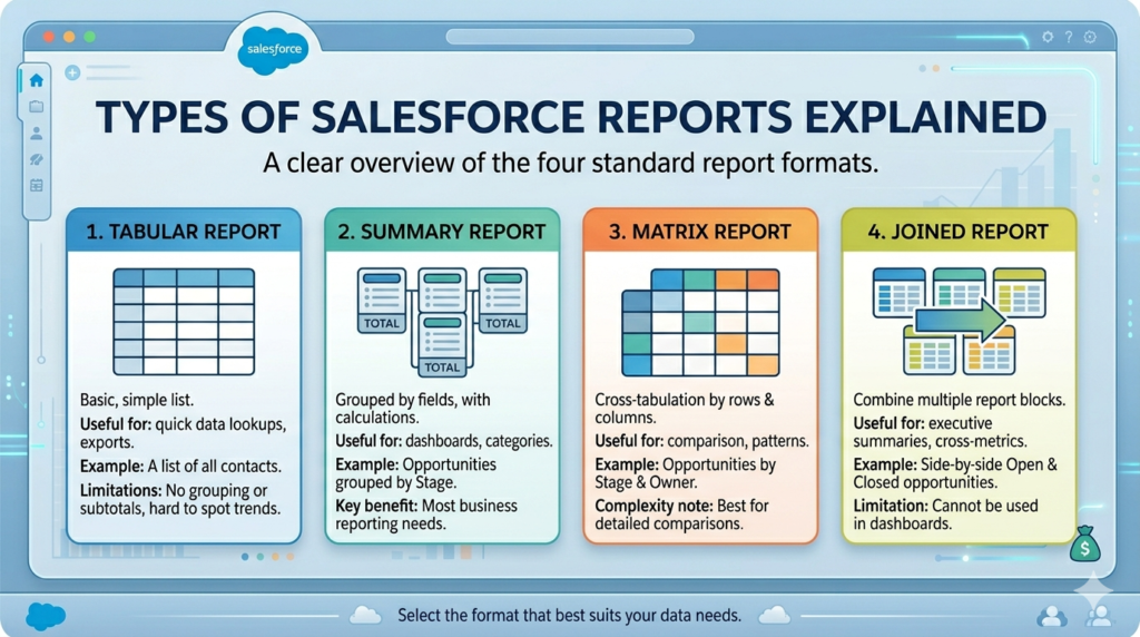
1. Tabular Reports
What it is: A simple spreadsheet-style list of records.
When to use it:
- You need a basic list without groupings or subtotals
- Exporting data for external analysis
- Quick data verification
Example: A list of all contacts with their email addresses and phone numbers.
Limitations:
- No grouping or summarization
- Not ideal for dashboards
- Hard to spot trends
Best for: Quick lookups and exports.
2. Summary Reports
What it is: Records grouped by a field with subtotals and calculations.
When to use it:
- You want to see data organized by categories
- Need subtotals and summaries
- Building dashboard components
Example: Opportunities grouped by Stage, showing total amount per stage.
Structure:
- Records are grouped (e.g., by Owner, Stage, Region)
- Each group shows a subtotal
- You can add multiple grouping levels
Best for: Most business reporting needs. This is your workhorse format.
3. Matrix Reports
What it is: Data grouped by both rows and columns, like a pivot table.
When to use it:
- You need to compare data across two dimensions
- Looking for patterns between two variables
- Creating heat maps or comparison charts
Example: Opportunities by Stage (rows) and Owner (columns), showing count in each cell.
Structure:
- Rows and columns both have groupings
- Data appears at intersections
- Ideal for cross-tabulation analysis
Complexity note: Harder for beginners to read initially, but powerful once you understand them.
Best for: Comparative analysis and identifying trends across dimensions.
4. Joined Reports
What it is: Multiple report blocks in one report, each with different criteria.
When to use it:
- Comparing related but different datasets
- Side-by-side performance comparisons
- Executive summaries combining multiple metrics
Example: One block showing open opportunities, another showing closed opportunities, displayed together.
Structure:
- Up to 5 report blocks
- Each block can have different filters
- Must share the same base object
Limitation: Cannot be used in dashboards.
Best for: Complex executive reports and comparative analysis.
Step-by-Step Guide: Creating Your First Salesforce Report
Let's build a practical report: All Open Opportunities by Stage.
Step 1: Navigate to Reports Tab
- Click the App Launcher (9 dots in the top-left)
- Search for and select Reports
- Click New Report
Step 2: Select Report Type
- Search for Opportunities
- Select Opportunities report type
- Click Continue
Important: The report type determines which fields are available. You cannot add Account fields to a Lead report type.
Step 3: Choose Report Format
- For this example, select Summary Report
- You can change this later if needed
Step 4: Add Filters
Filters determine which records appear.
- In the Filters panel, click Add Filter
- Select Stage
- Choose "not equal to" and select "Closed Won" and "Closed Lost"
- Click Apply
Additional useful filters:
- Close Date: This Month, This Quarter, Custom Date Range
- Owner: Specific sales reps or teams
- Amount: Greater than a specific value
Pro tip: Use filter logic (AND/OR) for complex criteria. Click "Add Filter Logic" at the bottom of the Filters panel.
Step 5: Select Columns
Default columns appear automatically. Customize them:
- Click Add Column
- Search for fields like:
- Opportunity Name
- Account Name
- Amount
- Close Date
- Stage
- Probability
- Owner
- Remove unnecessary columns by clicking the dropdown next to the column name and selecting Remove
Organization tip: Drag columns to reorder them logically (e.g., Name → Account → Amount → Stage → Close Date).
Step 6: Add Groupings
This is what makes it a Summary Report.
- Click Group Rows
- Select Stage
- Your report now groups opportunities by stage
You can add a second grouping:
- Click Group Rows again
- Select Owner
- Now you see opportunities grouped by Stage, then by Owner within each stage
Step 7: Add Summarizations
Calculate totals and counts:
- Hover over the Amount column header
- Click the dropdown arrow
- Select Summarize
- Choose Sum (this adds a total for each group)
You can also:
- Count records: Summarize → Count
- Find averages: Summarize → Average
- Show minimum/maximum values
Step 8: Customize and Format
Make your report easier to read:
- Chart: Click Add Chart to visualize data
- Conditional Highlighting: Highlight high-value opportunities
- Click Format → Conditional Highlighting
- Set conditions (e.g., Amount > $100,000 = Green)
Step 9: Save Your Report
- Click Save & Run
- Enter a report name: "Open Opportunities by Stage"
- Choose a folder (create "My Reports" folder if needed)
- Add a description (optional but helpful)
- Click Save
Step 10: Run and Verify
Your report runs automatically. Check:
- Are the right records showing?
- Are totals calculating correctly?
- Does the grouping make sense?
Common issue: If you see too many or too few records, recheck your filters.
Understanding Salesforce Dashboards
A Salesforce Dashboard is a visual display of multiple reports in one place. Think of it as your command center—a single screen showing key metrics that matter.
Dashboards contain components—charts, tables, metrics, and gauges—each pulling data from a report.
Why Dashboards Matter
- Quick insights: See critical metrics at a glance
- Real-time updates: Refresh automatically when viewed
- Stakeholder communication: Share visual updates with leadership
- Performance tracking: Monitor KPIs without digging through data
Dashboard Components Types
Chart: Bar, line, donut, funnel charts visualizing report data
Metric: A single number (e.g., "Total Revenue: $500K")
Gauge: Progress toward a goal with color-coded ranges
Table: Top records from a report
Each component sources from one report. One dashboard can have up to 20 components.
Step-by-Step Guide: Creating Your First Dashboard
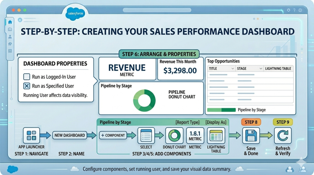
Let's build a Sales Performance Dashboard with three components.
Prerequisites
You need at least one saved report. If you followed the earlier section, you have "Open Opportunities by Stage."
Create two more quick reports:
- Closed Won Opportunities This Month (Tabular or Summary)
- Top 10 Opportunities by Amount (Summary or Tabular)
Step 1: Navigate to Dashboards
- Click App Launcher → Dashboards
- Click New Dashboard
Step 2: Name Your Dashboard
- Dashboard Name: "Sales Performance Dashboard"
- Folder: Select or create "My Dashboards"
- Click Create
Step 3: Add Your First Component (Chart)
The dashboard builder opens.
- Click + Component
- Select Report: Search for "Open Opportunities by Stage"
- Click Select
Component Settings:
- Display As: Choose Donut Chart
- Title: "Pipeline by Stage"
- Footer: (Optional) Add context like "Updated daily"
Chart Properties:
- Grouping: Stage (should auto-populate)
- Values: Sum of Amount
- Legend Position: Bottom or Right
Click Add when configured.
Your first component appears on the dashboard.
Step 4: Add a Metric Component
- Click + Component
- Select Report: Choose "Closed Won Opportunities This Month"
- Click Select
Component Settings:
- Display As: Choose Metric
- Title: "Revenue This Month"
Metric Properties:
- Grouping: Sum of Amount
- Show: Value only
Click Add.
You now have a big, bold revenue number on your dashboard.
Step 5: Add a Table Component
- Click + Component
- Select Report: Choose "Top 10 Opportunities by Amount"
- Click Select
Component Settings:
- Display As: Choose Lightning Table
- Title: "Top Opportunities"
- Sort By: Amount (Descending)
- Max Rows: 10
Click Add.
Step 6: Arrange Components
Drag components to organize your layout:
- Place the Metric at the top (full width or half-width)
- Place the Donut Chart below on the left
- Place the Table on the right
Layout tip: Use the grid system. Components snap to columns for clean alignment.
Step 7: Set Dashboard Properties
Click Edit in the top-right, then Properties:
- Running User: Who sees the data?
- "Run as logged-in user" (each user sees their own data)
- "Run as specified user" (everyone sees the same data, e.g., all company data)
Critical choice: Running user affects data visibility based on sharing rules and permissions.
Best practice: For team dashboards, run as a specific user with broad access. For personal dashboards, run as logged-in user.
Step 8: Save Your Dashboard
- Click Save
- Click Done
Your dashboard is live.
Step 9: Refresh and Verify
- Click Refresh to update data
- Verify components display correctly
- Check that numbers match source reports
Auto-refresh: Lightning Experience dashboards refresh when you open them. Classic dashboards cache data.
Best Practices for Salesforce Reports & Dashboards
These aren't generic tips. They're lessons learned from real implementations.
Report Best Practices
1. Name reports descriptively
Bad: "Report 1," "Sales Report"
Good: "Open Opps by Stage Q1 2024," "Cases Opened Last 30 Days"
Why: You'll create dozens of reports. Clear names save time.
2. Use folders strategically
Structure:
- Public folders for team-shared reports
- Private folders for work-in-progress
- Department folders (Sales, Service, Marketing)
Access control: Set folder permissions to control who can view, edit, or manage.
3. Filter by date intelligently
Use relative date filters instead of hard dates:
- "Current FQ" instead of "1/1/2024 - 3/31/2024"
- "Last 30 Days" instead of specific date ranges
Why: Reports stay relevant without manual updates.
4. Limit columns to essentials
More columns ≠ better insights. Include only what users need.
Guideline: 5-10 columns maximum for readability.
5. Add report descriptions
Click Edit → Description → Explain what the report shows and how it's filtered.
Example: "Shows all open opportunities with close dates in the current quarter, grouped by owner and stage."
Why: Helps users understand context, especially when you're not there to explain.
6. Schedule critical reports
Reports Tab → Select Report → Subscribe → Schedule frequency
You can email reports daily, weekly, or monthly to stakeholders.
7. Test with real data
After creating a report, manually verify:
- Pick a random record and confirm it meets filter criteria
- Check calculations manually
- Compare totals with known benchmarks
Dashboard Best Practices
1. Limit to 5-7 components
Too many components = information overload.
Focus on key metrics. If you need more, create multiple dashboards by theme.
2. Design for your audience
- Executives: High-level metrics, trends, minimal detail
- Managers: Performance by team member, conversion rates
- Reps: Personal pipeline, task lists, upcoming activities
3. Use color purposefully
- Green: Good performance, on track
- Yellow: Warning, needs attention
- Red: Problem, immediate action required
Don't use color randomly. Make it meaningful.
4. Place the most important metric top-left
Users' eyes go there first. Put your #1 KPI in that spot.
5. Update dashboard running user when team members leave
If a dashboard runs as a user who leaves the company, it breaks.
Solution: Run critical dashboards as a system admin or generic "Dashboard User" profile.
6. Create a dashboard navigation structure
Build a "Home" dashboard with links to specialized dashboards:
- Sales Performance
- Service Metrics
- Marketing ROI
- Executive Summary
Use text components with hyperlinks to other dashboards.
7. Set component refresh schedules wisely
Dashboards refresh on view in Lightning, but you can schedule refreshes:
- High-priority, data-sensitive dashboards: Refresh daily
- Static or slow-changing data: Weekly or on-demand
8. Document dashboard purpose
Add a text component at the top explaining:
- What the dashboard shows
- Who should use it
- When it updates
Common Mistakes Beginners Make (And How to Avoid Them)
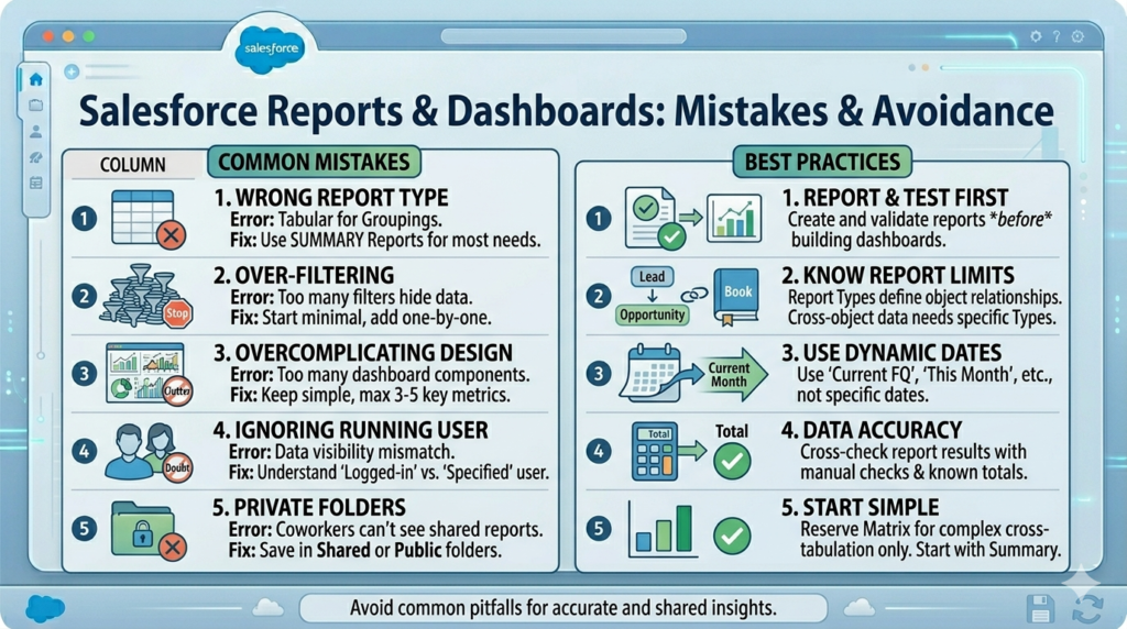
Mistake 1: Choosing the Wrong Report Type
The error: Starting with a Tabular report when you need groupings.
The fix: Default to Summary reports for most use cases. Switch to Tabular only for simple lists or exports.
Mistake 2: Over-filtering
The error: Adding so many filters that no records show up.
The fix: Start with minimal filters. Add them one at a time. Run the report after each addition to see the impact.
Debug tip: Remove all filters, run the report, then add filters back individually.
Mistake 3: Not Understanding Report Type Limitations
The error: Trying to add Lead fields to an Opportunity report.
The fix: Understand that report types define object relationships. If you need cross-object data, ensure the report type supports it (e.g., "Opportunities with Products").
Learn this: Study standard report types. Reports Tab → New Report → Browse available report types.
Mistake 4: Creating Dashboards Before Reports
The error: Trying to build a dashboard without source reports.
The fix: Always create and test reports first. Dashboards are visualizations of reports, not standalone tools.
Mistake 5: Ignoring Running User Settings
The error: Setting dashboard to "Run as logged-in user" when you want everyone to see all company data.
The fix: Understand the difference:
- Logged-in user: Respects record-level security (users see only what they have access to)
- Specified user: Everyone sees data as that user sees it (overrides individual permissions)
Use case: Executive dashboards typically run as a specific user to show complete data.
Mistake 6: Not Testing Data Accuracy
The error: Assuming reports are correct without verification.
The fix: Cross-check report results:
- Manually count a subset of records
- Compare totals with known figures
- Verify calculations (Sum, Average) with a calculator
Reality check: Filters and field selection can skew results. Always validate.
Mistake 7: Using Matrix Reports for Everything
The error: New users think Matrix reports look impressive and use them inappropriately.
The fix: Matrix reports are for cross-tabulation. Use Summary reports for 90% of needs. Reserve Matrix for specific comparative analysis.
Mistake 8: Forgetting to Set Folder Permissions
The error: Creating reports in private folders, then wondering why teammates can't see them.
The fix:
- Save shared reports in public or shared folders
- Set folder access: Folder → Share → Choose viewers/editors
- Check "Roles and Subordinates" to share with teams
Mistake 9: Hardcoding Date Filters
The error: Setting Close Date = 1/1/2024 - 3/31/2024
The fix: Use dynamic date filters:
- Current FQ (Fiscal Quarter)
- Current FY (Fiscal Year)
- Last N Days
- This Month
Reports stay evergreen without manual updates.
Mistake 10: Overcomplicating Dashboard Design
The error: Adding 15 components with clashing colors and random layouts.
The fix: Simple is better. Start with 3-5 components. Add only if there's a clear business need.
Design principle: Every component should answer a specific question. If it doesn't, remove it.
Real-World Use Cases for Salesforce Reporting for Beginners
Let's move from theory to practice. Here are scenarios you'll actually encounter.
Use Case 1: Sales Manager Tracking Team Performance
Need: See each sales rep's pipeline, close rate, and revenue this quarter.
Solution:
Report:
- Type: Summary Report
- Object: Opportunities
- Filters: Close Date = Current FQ
- Grouping: Owner
- Columns: Opportunity Name, Account Name, Stage, Amount, Close Date
- Summary: Sum of Amount per Owner
Dashboard:
- Component 1: Bar chart showing Sum of Amount by Owner
- Component 2: Metric showing total team revenue
- Component 3: Table with top 5 deals by amount
Outcome: Manager sees at-a-glance who's on track, who needs help, and where the team stands against quota.
Use Case 2: Service Manager Monitoring Case Resolution
Need: Track case volume, average resolution time, and backlog by priority.
Solution:
Report:
- Type: Summary Report
- Object: Cases
- Filters: Created Date = Last 30 Days
- Grouping: Priority
- Columns: Case Number, Subject, Status, Owner, Created Date, Closed Date
- Summary: Count of Cases, Average Age (custom formula if needed)
Dashboard:
- Component 1: Gauge showing total open cases vs. target
- Component 2: Donut chart of cases by priority
- Component 3: Table of oldest open cases
Outcome: Service manager identifies bottlenecks, assigns resources to high-priority cases, and prevents SLA breaches.
Use Case 3: Marketing Tracking Lead Conversion
Need: Understand which lead sources convert best and where leads drop off.
Solution:
Report:
- Type: Summary Report
- Object: Leads
- Filters: Created Date = Current FY
- Grouping: Lead Source, then Status
- Columns: Lead Name, Company, Status, Converted (checkbox)
- Summary: Count of Leads, Conversion Rate (formula field)
Dashboard:
- Component 1: Funnel chart showing lead progression through statuses
- Component 2: Bar chart of conversion rate by lead source
- Component 3: Metric showing total leads converted this quarter
Outcome: Marketing reallocates budget to highest-converting sources and optimizes campaigns.
Use Case 4: Executive Requesting Quarterly Business Review
Need: High-level snapshot of sales, service, and operations metrics.
Solution:
Create a Joined Report with three blocks:
- Block 1: Closed Won Opportunities this quarter
- Block 2: New Customers acquired
- Block 3: Customer satisfaction (from Case surveys)
Dashboard:
- Component 1: Metric for total revenue
- Component 2: Metric for new customer count
- Component 3: Gauge for customer satisfaction score
- Component 4: Line chart showing revenue trend over last 4 quarters
Outcome: Executive sees complete business health in one view, ready for board presentations.
Use Case 5: Admin Auditing Data Quality
Need: Find records with missing or incorrect data.
Solution:
Report:
- Type: Tabular Report
- Object: Accounts (or Leads, Contacts)
- Filters:
- Industry equals blank OR
- Phone equals blank OR
- Annual Revenue equals blank
- Columns: Account Name, Owner, Industry, Phone, Annual Revenue
Action: Export to Excel, assign cleanup to teams.
Outcome: Improved data quality, better segmentation, and more accurate reporting.
Career Importance: Why Salesforce Reports & Dashboards Matter for Your Job
If you're job-hunting or starting your Salesforce career, here's the truth:
Salesforce Reports & Dashboards Are Tested in Interviews
Common interview questions:
- "Can you walk me through how you'd create a report showing overdue opportunities?"
- "How would you build a dashboard for a sales VP?"
- "Explain the difference between Summary and Matrix reports."
You need hands-on experience to answer confidently.
It's a Core Admin Responsibility
Salesforce Administrators spend 20-30% of their time on reporting. You'll be asked to:
- Build reports for stakeholders
- Troubleshoot broken dashboards
- Create automated report subscriptions
- Train users on reading reports
It Demonstrates Business Acumen
Anyone can click through a Salesforce tutorial. Few can translate business questions into actionable reports.
Example:
- Business question: "Why are deals slipping?"
- Your solution: Create a report showing opportunities with close dates pushed back more than once, grouped by reason for delay.
This skill differentiates you from button-clickers.
Certifications Require It
The Salesforce Certified Administrator exam includes multiple questions on reports and dashboards:
- Report types and formats
- Dashboard running users
- Sharing and folder permissions
- Formulas in reports
Master this topic, and you pass the certification.
It Opens Doors to Analyst and Consultant Roles
Proficiency in Salesforce reporting for beginners is your gateway to:
- Salesforce Business Analyst
- Salesforce Consultant
- Sales Operations Analyst
- CRM Manager
These roles pay well and are in high demand.
Advanced Tips to Level Up Your Skills
Once you're comfortable with basics, try these:
Use Bucketing for Cleaner Groupings
Instead of grouping by exact amounts, create buckets:
- Small Deals: $0 - $10K
- Medium Deals: $10K - $50K
- Large Deals: $50K+
How: In Report Builder → Group Rows → Create Bucket Field
Build Cross-Filters
Show "Accounts WITH Opportunities" or "Contacts WITHOUT Cases."
How: Filters panel → Add → Cross Filter
Use Report Charts vs. Dashboard Charts
You can add charts directly to reports without creating dashboards.
When to use: Quick visualizations for personal use or embedded in record pages.
Create Dynamic Dashboards
Set dashboards to show personalized data for each viewer while running as logged-in user.
Example: Sales reps see only their own pipeline; managers see their team's.
Embed Reports in Record Pages
Add report charts to Account, Opportunity, or custom object pages.
How: Lightning App Builder → Add Component → Report Chart
Next Steps: Practice Exercises
Don't just read—do.
Exercise 1: Create a Lead Report
- Type: Summary
- Filters: Created Date = This Month
- Grouping: Lead Source
- Summary: Count of Leads
- Add a chart
Exercise 2: Build an Opportunity Dashboard
- Three components:
- Metric: Total pipeline value
- Chart: Opportunities by stage
- Table: Top 5 opportunities
Exercise 3: Matrix Report Challenge
- Object: Opportunities
- Rows: Stage
- Columns: Type (New Business, Existing Customer)
- Values: Sum of Amount
Exercise 4: Cross-Object Report
- Report Type: Accounts with Opportunities
- Show accounts with at least one open opportunity
- Group by Account Owner
Complete these, and you'll be ahead of 80% of Salesforce beginners.
Conclusion: Master Salesforce Reports & Dashboards to Stand Out
Salesforce Reports & Dashboards aren't just features—they're the bridge between raw data and business decisions. They turn a database into insights, and insights into action.
As a beginner, you now understand:
- The four report types and when to use each
- How to build reports step-by-step
- How to create dashboards that stakeholders actually use
- Best practices that prevent common mistakes
- Real-world applications that matter in your job
This Salesforce reports and dashboards tutorial gave you the foundation. But knowledge without practice is useless.
Your next move:
- Log into a Salesforce org (Trailhead Playground, Developer Org, or work environment)
- Create three reports today
- Build one dashboard this week
- Share it with a colleague or mentor for feedback
Salesforce reporting for beginners isn't about memorizing every option. It's about understanding the logic, practicing regularly, and solving real business problems.
Do that, and you won't just understand Salesforce Reports & Dashboards—you'll become the go-to person in your organization for insights that drive results.
Now stop reading and start building. Your first report is waiting.
How to Use Salesforce Reports & Dashboards: A Beginner's Practical Guide
About RizeX Labs
At RizeX Labs, we specialize in delivering cutting-edge Salesforce solutions that help businesses turn raw data into meaningful insights. Our expertise spans across reporting, automation, and dashboard design to enable smarter decision-making.
We help organizations move from scattered data to structured intelligence—empowering teams with real-time visibility, better forecasting, and actionable analytics.
Internal Links:
- Salesforce Field Service Lightning (FSL): Overview, Features & Career Scope
- How Long Does It Take to Learn Salesforce and Get a Job? Honest Timeline (India, 2026)
- How to Get Your First Salesforce Job with Zero Experience in India: The 2026 Reality Check
- How to Use Salesforce Reports & Dashboards: A Beginner's Practical Guide
- Salesforce Trailhead vs Paid Training: Which Is Better for Getting a Job in India (2026)?
- Top Companies Hiring Salesforce Professionals in Pune in 2026: Your Complete Career Guide
- Salesforce Flows vs Apex: When Should You Use Code vs No-Code Automation?
- Salesforce Nonprofit Cloud: Features, Use Cases, and Career Opportunities (2026 Guide)
- Salesforce Net Zero Cloud: What It Is and Why It's the Next Green Career Niche (2026 Guide)
- Salesforce Slack Integration: How It Works and What Developers Need to Know
- Salesforce Named Credentials: What They Are and How to Use Them Safely
- Salesforce Deployment Best Practices: Change Sets vs Salesforce CLI vs Gearset
External Links:
McKinsey Sales Growth Reports
Gartner Sales Automation Insights